Wednesday 16 November 2011

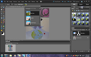
I used Adobe Photoshop elements 10 to modify the original images.Below are my examples.
1st art piece

This is my original sketch titled Two brains.

I first adjusted the size of my image to 15’ by 20’.
 I then adjusted the background.The original background was white so I used the smart brush tool and chose the blue sky background.After that,I adjusted the colour tone from a darker shade to a lighter shade


Once I have inserted the background,I used the paint bucket tool and filled up the selected parts with neon paint.I then adjusted the colours using the gradient editor.
After inserting the colours,I adjust the brush to 5 px and draw the overline of my images.
Once I have drew the lines,I used the colour picture background and used a light shade of purple to tint my images.

2nd piece
This is my original pencil and colour pencil sketch titled futuristic communication
Firstly,after opening the image,I adjusted the size to 16’ by 20’.
I then highlighted the upper quarter part of the sketch and chose the chocolate tone from the colour choice.
To which I made a few tone adjustments. I wanted the top part to be darker so that it would complement my alien bubbles.
After that,I decided to make the rest of the background into a sunset layer as it was of a lighter tone and was a bright colour as well.I used the smart brush tool and chose the theme nature for this step
For the laptop colour,I inserted a bright blue tone from the brush tool and adjusted the colour till it became neon blue.
Once I was satisfied with the laptop’s colour,I then moved on to the alien like body for which I choose the colour red through the brush tool but I also used the brush and made thin lines so give a two colour effect.
I used the paint tool to insert a light brown tone into the alien bubble and then used the gradient editor to change the tone of the colour chosen
I also used the paint tool to insert a dark black colour for the alien’s eyes.
This is the final product of my sketch.

Monday 24 October 2011

Lets Communicate!


Modern Communication
Principles of Design
There is a balance in this sketch as the large object is placed in the center and it is surrounded my all the smaller objects.
There is dominance in this sketch as well whereby the earth mostly domintaes the whole sketch compared to the other objects.

Elements of Design
The shapes used in this sketch is mostly geormetric.
The direction of this sketch would be oblique as the drawing around the earth gives an oblique effect.
The colours used are very bold and bright so that the sketch does not become boring.
 

I Hear You
Principles of Design
There is balance in this sketch as there is different sizes of the planets all drew in a straight line.
The most obvious principle of design would be the repetition.This sketch repeats the circular shape.

Elements of Design
Although the objects drew may give an oblique direction but they are drew on a staright line that gives a vertical line direction.
The colours used are bold and a combination of a few different colours to brighten up the sketch.
The shapes used is circles which is basicly geometric.


The Art of Communicating
Principles of Design
There is repetition in the sketch as there is a mirror effect top the drawing.
There is also contrasts in the drawing as only the ear phones are coloured in bright red colour.

Elements of Design
There are  alot of curvy lines used to form the faces.
There is a combination of different shapes present in this sketch.
There were not many colours used as only the important objects were emphasized.


Different Worlds
Principles of Design
There is repition as the mirror effect is peresnt.
The two large objects above the small earth however balances the sketch.

Elements of Design
There is a lot of curvy and staright lines used.
The colours used were bright to allow the message difference to stand out.


Perfection
Principles of Design
The orange ring around the earth gives the sketch some kind of balance.
There is a lot of contrast between the two different coloured hands and the colourless earth.

Elements of Design
There is a lot of curvy lines in this sketch.
The colours used in this sketch is very basic and light except for the orange ring around the earth.


Relating
Principles of Design
The 4 human like figures drew is a form of repitition.
The 4 human like figures also dominates the whole sketch compared to the earth.

Elements of Design
The colours used are vibrant and bold.
The size of the 4 human like figures are large and occupy 3/4 of the space.
 

1 World
Principles of Design
There is balance in this sketch as there is a large hand and relatively small earth.
There is a lot of harmony in this sketch as well as the colours and the objects relate well.

Elements of Design
There are more curby lines used compared to staright lines.
The colours used relates to the colours of the objects in reality.


Futuristic Communication
Principles of Design
There is balance in this sketch as there are 2 large circles and smaller laptops.
The two circles drew are repition as the same shape is repeated twice.

Elements of Design
The shapes used are mostly geometric.
The colours contra with one another as dark colours are used agianst completely light colours.


Communication Bubbles
Principles of Design
There is a lot of repetition as the conversation bubbles are drew repeatedly.
There is positive balance as well as there is more than 2 different sizes.

Elements of Design
The size of the coversation bubbles are larger than the small figures.
There are many different shapes used in this sketch.


Monday 19 September 2011

Beauty is in the eyes of the beholder...

IMPRESSIONISM!!!
Impressionism was a 19th-century art movement that originated with a group of Paris-based artists whose independent exhibitions brought them to prominence during the 1870s and 1880s. The name of the style is derived from the title of a Claude Monet work, Impression,  (Impression), which provoked the critic to coin the term in a satiric review published in the Parisian newspaper.
Characteristics of Impressionist paintings include relatively small, thin, yet visible brush strokes; open composition; emphasis on accurate depiction of light in its changing qualities (often accentuating the effects of the passage of time); common, ordinary subject matter; the inclusion of movement as a crucial element of human perception and experience; and unusual visual angles.

Artist : Elena Kapustina


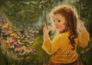
Elena Kapustina, is a Russian oil painter who swears by the theme impressionism.

She was born in Ryazan, Russia. In the period 1984-1989 studied in the Ryazan state pedagogical institute. After graduating from the institute she worked at school as a teacher of drawing. Was the head of the Fine art studio. Working with children Elena found her original style. She takes an active part in many regional exhibitions. Many of her artworks are in private collections of Russia, Spain, Italy, the USA, Germany. There is not much said about her and her work but her art work is well known among art lovers who admire them.She inspires me through her work and dedication towards her art pieces.After doing a research on her,i realised she is a very shy person and prefers to express herself through her paintings.She travels a lot hence her paintings show what her eyes see as she travels. 

The beauty of life and the joy of living is what Elena expresses in her canvases.Her art work is basically based on reality and then a touch of fantasy is thrown in to mesmerize her art work.

   OLD MILL
The Elements of Design.
Line : There are linear and curvy linear lines used in this painting.The artist used the edge of the brush to create the lines or shape.

Shape : Many shapes in this painting is formed through lines that created illusions of the object that is shown.

Size : As there are so many colours used,the size of the wooden house painted looks small compared to its surrounding.

Texture : As this is an oil painting,the texture is rough and glossy.The pain is overlapped hence creating different shades in the painting.

Colour : There are many colours used in this painting.Most of the colours took form through the combination of a few colours.

Direction : The directions used in this painting is mostly oblique.The oblique direction gives the painting a sense of movement in a circular direction.

The Principles of Design.
Balance : This painting has an asymmetrical balance..The placement of the focus object is far towards the left of the painting.Thus the painting is not very balanced .

Rhythm : This painting has a timed movement through space; an easy, connected path along where the eye follows a regular arrangement of colours and motifs.

Emphasis : The emphasis in this painting is the wooden house.The movement in the painting actually draws the viewer's attention towards the wooden house.The contrast of the size and colour also makes it  stand out in the painting.


Below are few other paintings on the theme impressionism.


NUT TREE


WINDY DAY
      

SUNNY ELVES by
Sapozhnikova Svetlana


KISS


The pictures are taken from http://www.arthit.ru/impressionism/0067/impressionism.html. Her other art pieces can be viewed on the same website.

Pictures are retrieved of ART HIT GALLERY.

Sunday 11 September 2011

The Reason behind Life...

Jasreen Kaur was born on 1st December 1989 in a small town called Klang.She was raised by a quite modern Sikh family and was the eldest child for her parents.She currently still resides in that very same house and area where she was born and raised.


Her exposure to life was enlightened by her father,Guldip Singh who is an aircraft engineer and her mother,Suvaran Kaur who is a housewife.It was he father that embedded the value trust and sincerity in her since young.He was a tough man back then to deal with as he had a certain level of expectations.Jasreen idolizes her dad although he was a very strict and stern man but with a gold heart.Else than having lovely parents,Jasreen has a younger brother whom she unconditionally loves.Blessed with just a small family,she has always tried to set the best example for her younger brother.


Jasreen completed her Diploma in Science from Murdoch University,Perth in the year 2010.She picked up a great liking for animals and since then she has always wanted to make a difference and contribution towards the animal kingdom.


Her interest has always been animals and she developed a deep admiration for them after staying in the country side for a few months.Jasreen's interest is towards the animals' welfare and the future of their species.


Jasreen believes in dreaming big.She wants to own an animal farm or a zoo someday that will accommodate many animals,let it be small or big.She wants to fight for the animals' rights and reduce abuse against them.She wants the animals to be treated fairly and prevent further extinction of animals.


Jasreen aspired to be a millionaire in her own way.In her view,money is not the sole material that would make her rich but values and humanity will make her rich.Through her humanity work,she will someday aspire to contribute to her country as well.Else than that,she wants to become a fantastic cook,loving human and have a peaceful life ahead.


HAN 102

Good day All,


Welcome to HAN 102.I have enrolled for this subject with much anticipation and hope to do my level best in acing this subject with the help and co-operation from my lecturer,Mr.Deepak K Menon who himself is a great inspiration and also my friends and not forgetting my family.


May this blog becomes a start to a new chapter for me.


Thank You


Best Wishes,


jasreen